01.
Setting the visual direction, building the design system, and shaping the overall vision of the brand
led the project from its inception, defining the visual direction, developing the design system, and crafting the brand’s overall vision.

02.
03.
What stood out most was his ability to bring structure to ambiguity. Even when the scope was messy, he created a thoughtful UX direction that helped the team move faster and with more confidence.
Starting by research
I began by exploring how different types of data can be visualized within a digital product. I researched chart types, their purposes, and the kinds of information they can communicate effectively.
The goal was to understand which visualizations best fit the data, the user’s needs, and the decisions they needed to make.

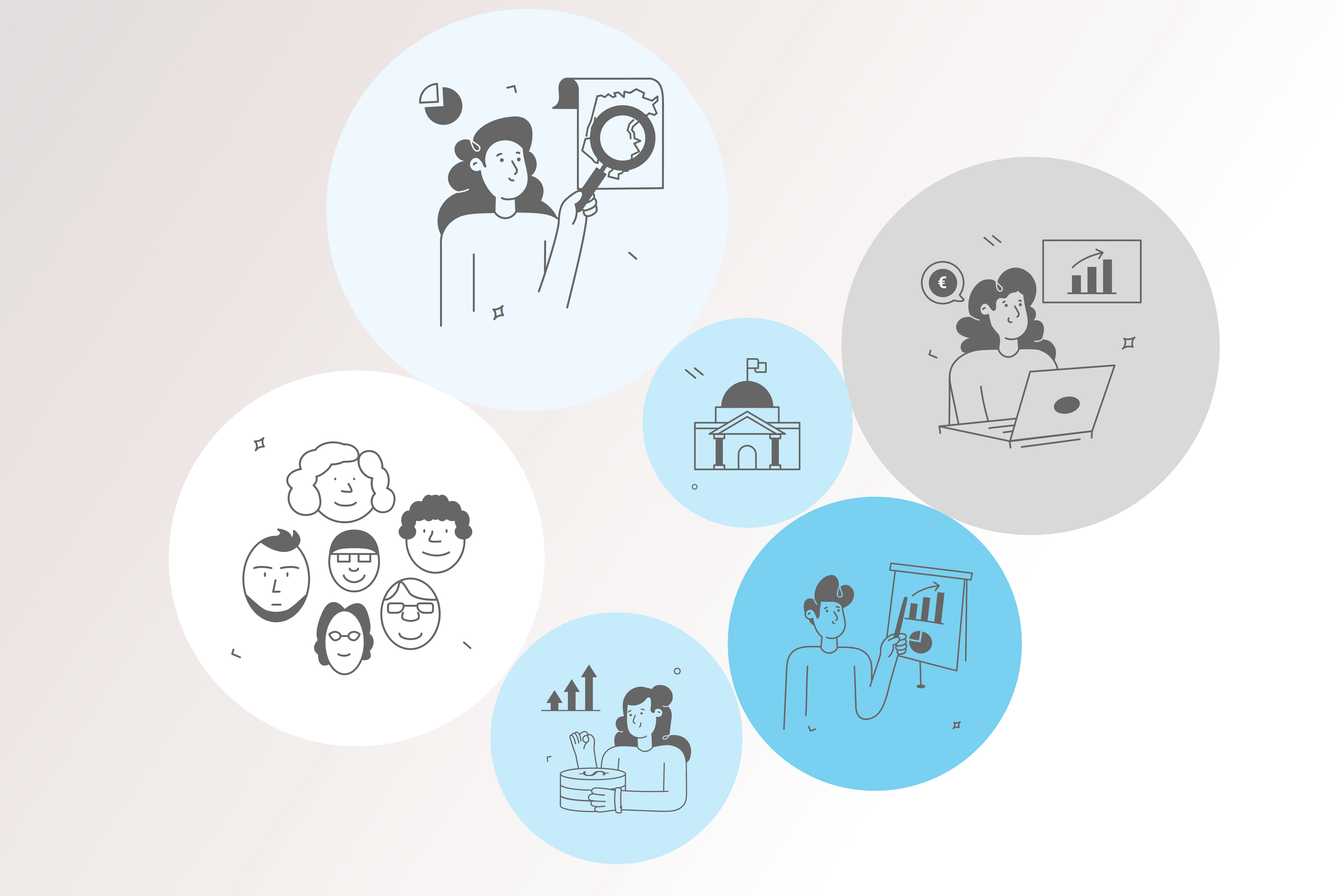
Understanding user needs.
Alongside the product owner, I conducted workshops and interviews to understand how users would use the platform and what information they needed to make better decisions.
Key needs identified:
Understand the evolution of a municipality’s economic profile and consumption patterns, including where consumers come from.
Monitor consumer loyalty by comparing local consumption with activity in other areas.
Identify the main local economic sectors and understand consumers’ shopping behaviour.
Track the evolution of different sales channels, including digital channels and marketplaces.
Defining the target.
Age: 25–60
Occupation: City hall professionals
Area: Financial management
Experience: Familiar with data visualization
Primary goal: Monitor the local economy
Key focus: Analyze consumption within the municipality
Additional need: Measure the economic impact and regional return of events, such as Christmas.


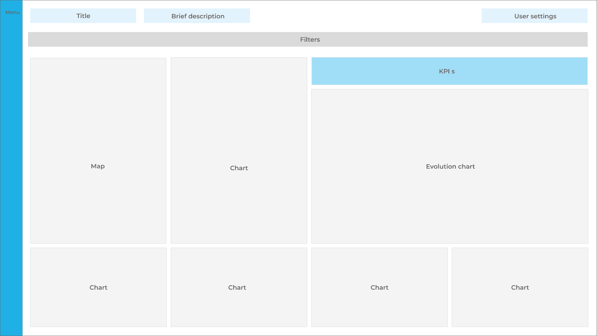
Design system.
After reviewing the wireframes with users, I moved into the visual design phase and defined the product’s design system.
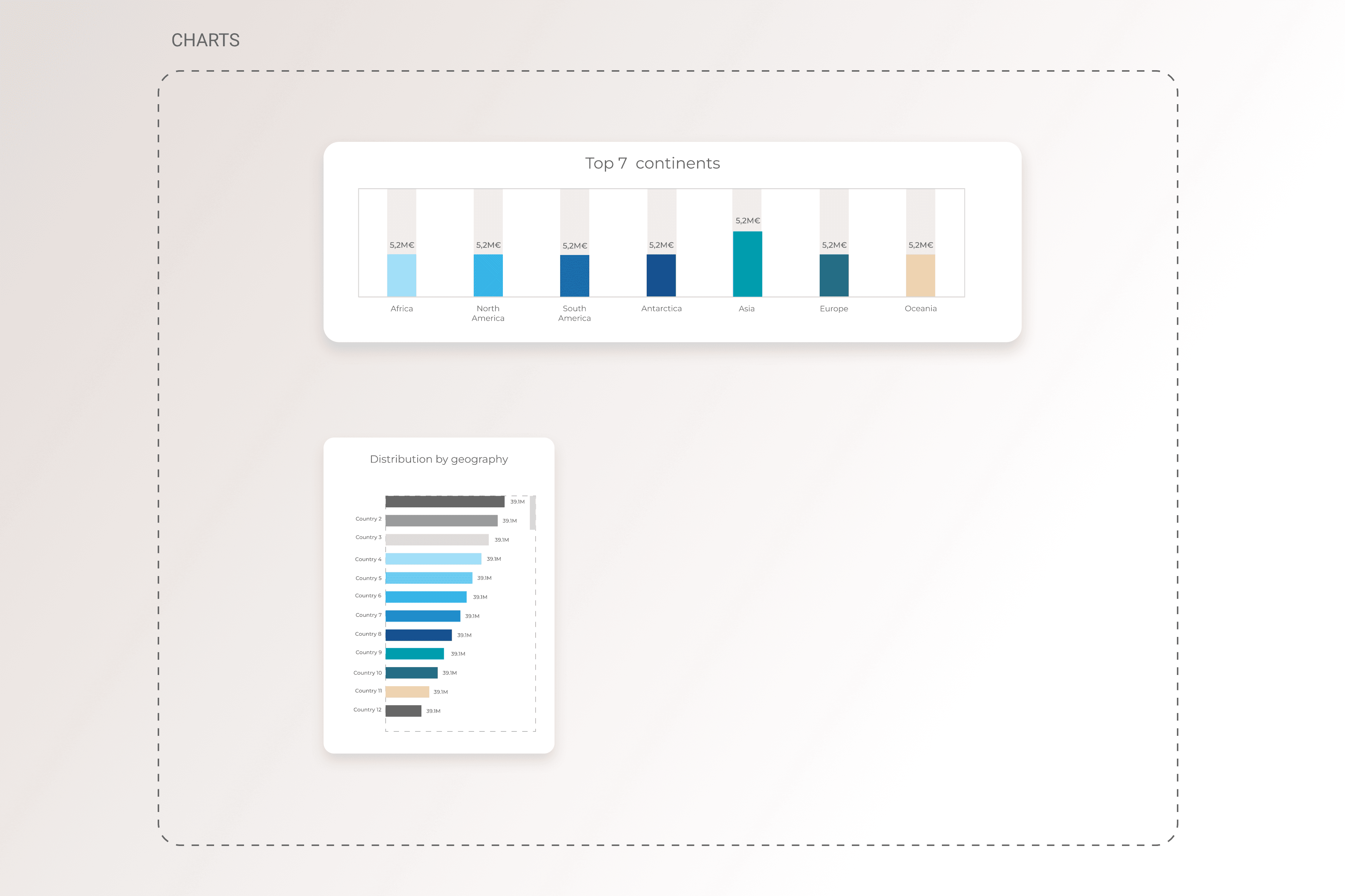
The direction was intentionally clean and restrained, keeping the interface focused on the data rather than competing with it. The visual language needed to make complex information easy to scan, interpret, and compare.
The existing brand guidelines established a palette of blues and neutrals, which provided the foundation for the interface. However, data visualization required a broader range of colors to clearly differentiate datasets and communicate meaning. I extended the palette with carefully selected beige and green tones, keeping the visual language cohesive while giving the charts enough contrast and flexibility.



Logo design.
As part of the project, I was also responsible for creating the product name and visual identity. I explored existing visual references combining geographical elements, data, and analytics, looking for a direction that could represent both sides of the product.
The concept evolved around the ideas of “neighborhoods” and “digital”, translating the purpose of the platform into a simple and recognisable visual mark. As the product was powered by SIBS Analytics, I also kept the identity aligned with its clean visual language, lines, and colour palette.


The final logo brings together the two core ideas behind the product: geography and financial data. The location pin represents the geographical dimension, while the chart inside it reflects the platform’s role in turning financial data into clear, actionable insights for local economies. Turning local data into clear insights.

I created a high-fidelity prototype in Figma to bring the proposed product to life and demonstrate the complete user experience and interface.
The prototype focused on validating the navigation, interactions, and overall flow, ensuring users could move through the platform intuitively and understand how the different dashboards and data visualizations work together.
This project deepened my understanding of the financial sector and the complexity of working with large volumes of data.
I learned that data visualization is not simply about presenting information, it is about making complex data easier to understand and turning it into actionable insights. Effective visualizations can help users track KPIs, identify trends, compare performance, and ultimately make more data driven decisions.
The project also strengthened my research process and my ability to translate user needs into clear product and visualization decisions.
Understanding the data is only the beginning. The real value comes from making it meaningful to the people who use it.

